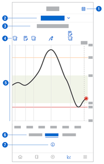
Trend Graph
The Trend Graph is an extended view of your Home screen that includes your logbook entries. You can select a 6, 12, or 24-hour view of your CGM data.
Swipe to the right to see values further in the past or tap the calendar button to jump to a specific date.
Tap the icons in the graph to see more information.
- Notes
- Carbohydrates
- Basal insulin injections
- Bolus insulin injections


- Calendar button: Enables you to select a specific date.
- Indicates Trend Graph is displayed; tap to select a different graph.
- Selected time range
- Notes, carbs, bolus and basal insulin injections
- Graphical representation of your glucose values over the selected time range.
- Select 6, 12, or 24-hour view
- Tap to see more information on the Trend Graph.
If there are ever gaps in your CGM data, these symbols will appear below the graph to explain the data gap.
New Sensor: A new sensor was paired and started sending data. | |
Sensor Connection Lost: The sensor could not retrieve all data due to the length of the connection loss. A connection loss longer than 8 hours will result in a data gap. For example, a connection loss lasting 10 hours will result in a data gap of 2 hours. | |
Temperature: The sensor was too hot or too cold to record glucose values. | |
Data Excluded: These glucose values are not shown because they did not meet our quality criteria. No action is required. |


To view your Trend Graph, proceed as follows:
- Tap Graphs.
- Select Trend Graph from the drop-down menu.
- The Trend Graph is displayed.
- Tap the time range you want the graph to represent.
- 6 Hours
- 12 Hours
- 24 Hours